Bootstrap uses classes to apply CSS rulesets — these rulesets dictate the layout and styling of the element. To create a container, necessary for Bootstrap's grid, we assign a class of
"container" to a <div> like so:
<div class="container"></div>
The
<div> from the example above becomes a Bootstrap container which has a width relative to a user's screen size, becomes horizontally centered, and has a left and right margin.
If we wanted the container to take up the entire width of the screen we can assign a class of
"container-fluid":
<div class="container-fluid"></div>
Rows
we can add as many rows as we want inside a container. By default, a row will take up the entire width of its parent container. To create a row we assign a
class of "row" to an element. Take a look at the provided example with a nested row inside a container:
<div class="container">
  <div class="row">
  </div>
</div>
Columns
Columns are the immediate children of rows and store content. By default, a column will take up the entire width of its parent row. As we add more columns inside a row, the default behavior is for each column's width to be readjusted to fit in the row — each column will have the same width. At most, a row will accommodate 12 columns. Study the diagram below to see how column sizing works:

To create a column, we assign an element with the
class of "col". Take a look at the provided example with a container that has a nested row which has a nested column:
<div class="container">
  <div class="row">
    <div class="col">
    </div>
  </div>
</div>
Setting Column Widths
we can make columns of varying widths.
We can decide the width of a column by appending a hyphen and a number to the
"col" class like so:
<div class="col-8">
  <p>This is the width of 8 columns.</p>
</div>
In our example, our row still has 4 columns worth of space. If we decide to add an adjacent column, we could also set our desired width like so:
<div class="row">
  <div class="col-8">
    <p>This is the width of 8 columns.</p>
  </div>
  <div class="col-4">
    <p>This has the width of 4 columns.</p>
  </div>
</div>
If we didn't specify a desired width for the second column, it would still resize itself to fill in the remaining space in the row. But, by adding
"-4", we make our code more readable and allow other developers to clearly know our intentions.Setting Column Width with Content
Another option we could use to set the width of a column is the content inside the column.
auto to content inself.
If we want to use the content to set a column's width, we append
"auto"to the class of the column, for example:
<div class="col-auto">
  <p>This content determines the width of the parent column</p>
</div>
In the example above, the width of the column is determined by the text inside the
<p> element.Bootstrap Breakpoints
Bootstrap categorizes screen sizes into 5 categories or as breakpoints: extra small, small, medium, large, and extra large. Each breakpoint has a range measured in pixels.
| Category | Breakpoint Range | Device Type |
|---|---|---|
| Extra small | < 576 px | portrait smartphones |
| Small | ≥ 576 px | landscape smartphones |
| Medium | ≥ 768 px | tablets |
| Large | ≥ 992 px | desktops |
| Extra Large | ≥ 1200 px | large desktop |
By using these breakpoints in combination with Bootstrap's grid, we can customize the layout of our content for different screens.
Breakpoint Naming Convention
Using Bootstrap, we can freely change the layout of our content using grid. We can even customize how our content on the grid changes based on breakpoints (extra small, small, medium, large, extra large). To incorporate these breakpoints into our code, we have to follow Bootstrap's class naming convention.
The naming convention follows a pattern of
"col-{breakpoint}-{width}". Let's break this pattern down:- As seen before
"col"refers to a column. {breakpoint}can besm,md,lg, orxl. Notice that there is no extra small orxsbreakpoint. If we omit{breakpoint}, it is by default for extra small screens.{width}can be set from1to12and assigns a width to the column.- When we set a
{breakpoint}-{width}, it means that we want our column to have that set width for screens that fit in the specified breakpoint range and other larger screens.
For instance:
<div class="col-sm-8">
</div>
The column in the example will be as wide as 8 individual columns on small screen sizes and also any larger screens (medium, large, and extra large).
Combining Bootstrap Classes
First, we'd want to think about how our column looks like on extra small screens. Since we don't have much space, we would want to have our column take up the entirety of the row and assign a class of
"col-12". We don't include an xs breakpoint, it's implicitly applied for us! Our column looks like:
<div class="col-12">
</div>
Then we decide that for medium-sized screens we don't want the column to take up so much space, so we could set the width to
8. We use the Bootstrap naming convention and add an additional class to the column like so:
<div class="col-12 col-md-8">
</div>
For large screen sizes, we want the column to take up even less relative space and we set the width to
6. We have to add another class to the column:
<div class="col-12 col-md-8 col-xl-6">
</div>
From the example, we have a column that renders a different width based on a user's screen size. On extra small and small sized screens, the column has a width of 12 individual columns. For medium and large sized screens, the column has a width of 8 individual columns. Lastly, for extra large screens, the column has a width of 6 individual columns. We could've even used up all of Bootstrap's provided breakpoints!
Bootstrap 4 Grid Review
Great job navigating through Bootstrap's grid!
Let's review some key concepts:
- When in doubt, check Bootstrap's documentation.
- There are a few required links to use Bootstrap (the CSS file and two
<meta>tags) - Bootstrap 4 has a grid system implemented using flexbox
- The grid system is made of containers, rows, and columns that work together to make a web page's layout.
- Containers are needed to implement the grid.
- Containers hold rows which hold columns.
- Bootstrap's grid follows a 12 column system.
- Bootstrap uses responsive design and is built around breakpoints related to device screen sizes.
- To manually set the width of a column we have to follow Bootstrap's naming convention.
- We can add multiple classes to a column to determine how wide a column should be on specific breakpoints.
Adding Colors
Let's say we want to change the text color of our paragraph element from the default black to blue. We would add a class of"text-primary", like so:<p class="text-primary">This text is blue!</p>According to the documentation, the"text"portion of the class targets the element's text styling. Appending"primary"after"text"changes the text color to blue. The name of the class,"text-primary", also signifies that this<p>element conveys information that appears first, i.e, is the primary text.we can also change the background color:<div class="bg-success"> Green! This signifies success! </div>In the example above, we've assigned the<div>element a class of"bg-success". The"bg"part references the element's background and"success"changes the background color to green.Styling Text
For instance, if we want our text to be bold, we could add a class of"font-weight-bold"like so:<p class="font-weight-bold"> This rendered text is bold. </p>We can also combine Bootstrap classes for additional styling. Let's say we wanted our text to also be uppercased. We would add"text-uppercase"to the class attribute:<p class="font-weight-bold text-uppercase"> This rendered text is both bold and uppercased. </p><p class="text-lowercase">Lowercased text.</p> <p class="text-uppercase">Uppercased text.</p> <p class="text-capitalize">CapiTaliZed text.</p><p class="font-weight-bold">Bold text.</p> <p class="font-weight-bolder">Bolder weight text .</p> <p class="font-weight-normal">Normal weight text.</p> <p class="font-weight-light">Light weight text.</p> <p class="font-weight-lighter">Lighter weight text .</p> <p class="font-italic">Italic text.</p><p class="text-monospace">This is in monospace</p>Reset color
Reset a text or link’s color with.text-reset, so that it inherits the color from its parent.Muted text with a reset link.<p class="text-muted"> Muted text with a <a href="#" class="text-reset">reset link</a>. </p>Text alignments<p class="text-left">Left aligned text on all viewport sizes.</p> <p class="text-center">Center aligned text on all viewport sizes.</p> <p class="text-right">Right aligned text on all viewport sizes.</p> <p class="text-sm-left"> viewports sized SM (small) or wider.</p> <p class="text-md-left"> viewports sized MD (medium) or wider.</p> <p class="text-lg-left"> viewports sized LG (large) or wider.</p> <p class="text-xl-left">viewports sized XL (extra-large) or wider.</p>Element Positioning
When considering the layout of a webpage, we have to think about how to position our elements. Conveniently, Bootstrap provides positioning utility classes.For example, if we want an element that is fixed to the top, we can apply a"fixed-top"class:<div class="fixed-top"> This div will be fixed at the top of the screen. </div>There are a few other positioning utility classesCommon values
<div class="position-static">...</div>
<div class="position-relative">...</div>
<div class="position-absolute">...</div>
<div class="position-fixed">...</div>
<div class="position-sticky">...</div>
Fixed top
<div class="fixed-top">...</div>Fixed bottom
<div class="fixed-bottom">...</div>Sticky top
Position an element at the top of the viewport, from edge to edge, but only after you scroll past it. The.sticky-toputility uses CSS’sposition: sticky, which isn’t fully supported in all browsers.IE11 and IE10 will renderposition: stickyasposition: relative. As such, we wrap the styles in a@supportsquery, limiting the stickiness to only browsers that can render it properly.<div class="sticky-top">...</div>The Navigation Component
In addition to useful utility classes, Bootstrap offers a collection of components, such as a navbar, buttons, a carousel/slideshow for images, and much more! Each Bootstrap component serves a distinct purpose and we can find examples and code snippets directly from the documentation — then, we can tweak the components to our personal needs.The first component we'll investigate is the navigation (nav) componentwhich offers our users a collection of links. The nav component is slightly different from a navbar component. The nav component is often specific to one or a few webpages, whereas a navbar often appears on all the pages of a website.There are many ways to create a basic nav component. Here's one example:<ul class="nav"> <li class="nav-item"> <a class="nav-link" href="#">First Link</a> </li> <li class="nav-item"> <a class="nav-link" href="#">Second Link</a> </li> </ul>In the above example:- We created a navigation component using an
<ul>that has a class of"nav". - The
<ul>has nested<li>elements which each have a class of"nav-item". - Inside each
<li>is an<a>which has a class of"nav-link".
Alternatively, for a simpler nav component of only links:<nav class="nav"> <a class="nav-link" href="#">First Link</a> <a class="nav-link" href="#">Second Link</a> </nav>Notice that we still have the parent element with a class of"nav"and the children elements with a class of"nav-link". Both examples render the same links, but we might choose one example over the other depending on how we want our layout to look.- We created a navigation component using an
- Classes are used throughout, so your markup can be super flexible. Use
<ul>s like above,<ol>if the order of your items is important, or roll your own with a<nav>element. Because the.navusesdisplay: flex, the nav links behave the same as nav items would, but without the extra markup.
<nav class="nav">
  <a class="nav-link active" href="#">Active</a>
  <a class="nav-link" href="#">Link</a>
  <a class="nav-link" href="#">Link</a>
  <a class="nav-link disabled" href="#" tabindex="-1" aria-disabled="true">Disabled</a>
</nav>
Available styles
Horizontal alignment
Change the horizontal alignment of your nav with flexbox utilities. By default, navs are left-aligned, but you can easily change them to center or right aligned.Centered with.justify-content-center:- Right-aligned with
.justify-content-end: Vertical
Stack your navigation by changing the flex item direction with the.flex-columnutility. Need to stack them on some viewports but not others? Use the responsive versions (e.g.,.flex-sm-column).Tabs
Takes the basic nav from above and adds the.nav-tabsclass to generate a tabbed interface.Pills
Take that same HTML, but use.nav-pillsinstead:Fill and justify
Force your.nav’s contents to extend the full available width one of two modifier classes. To proportionately fill all available space with your.nav-items, use.nav-fill. Notice that all horizontal space is occupied, but not every nav item has the same width.<ul class="nav nav-pills nav-fill"> <li class="nav-item"> <a class="nav-link active" href="#">Active</a> </li> <li class="nav-item"> <a class="nav-link" href="#">Longer nav link</a> </li> <li class="nav-item"> <a class="nav-link" href="#">Link</a> </li> <li class="nav-item"> <a class="nav-link disabled" href="#" tabindex="-1" aria-disabled="true">Disabled</a> </li> </ul>When using a<nav>-based navigation, be sure to include.nav-itemon the anchors.- For equal-width elements, use
.nav-justified. All horizontal space will be occupied by nav links, but unlike the.nav-fillabove, every nav item will be the same width.
<nav class="nav nav-pills nav-justified">
  <a class="nav-link active" href="#">Active</a>
  <a class="nav-link" href="#">Longer nav link</a>
  <a class="nav-link" href="#">Link</a>
  <a class="nav-link disabled" href="#" tabindex="-1" aria-disabled="true">Disabled</a>
</nav>
Similar to the.nav-fillexample using a<nav>-based navigation, be sure to include.nav-itemon the anchors.
<nav class="nav nav-pills nav-justified">
  <a class="nav-item nav-link active" href="#">Active</a>
  <a class="nav-item nav-link" href="#">Link</a>
  <a class="nav-item nav-link" href="#">Link</a>
  <a class="nav-item nav-link disabled" href="#" tabindex="-1" aria-disabled="true">Disabled</a>
</nav>
Working with flex utilities
If you need responsive nav variations, consider using a series of flexbox utilities. While more verbose, these utilities offer greater customization across responsive breakpoints. In the example below, our nav will be stacked on the lowest breakpoint, then adapt to a horizontal layout that fills the available width starting from the small breakpoint.
<nav class="nav nav-pills flex-column flex-sm-row">
  <a class="flex-sm-fill text-sm-center nav-link active" href="#">Active</a>
  <a class="flex-sm-fill text-sm-center nav-link" href="#">Link</a>
  <a class="flex-sm-fill text-sm-center nav-link" href="#">Link</a>
  <a class="flex-sm-fill text-sm-center nav-link disabled" href="#" tabindex="-1" aria-disabled="true">Disabled</a>
</nav>
Regarding accessibility
If you’re using navs to provide a navigation bar, be sure to add arole="navigation"to the most logical parent container of the<ul>, or wrap a<nav>element around the whole navigation. Do not add the role to the<ul>itself, as this would prevent it from being announced as an actual list by assistive technologies.Note that navigation bars, even if visually styled as tabs with the.nav-tabsclass, should not be givenrole="tablist",role="tab"orrole="tabpanel"attributes. These are only appropriate for dynamic tabbed interfaces, as described in the WAI ARIA Authoring Practices. See JavaScript behavior for dynamic tabbed interfaces in this section for an example.Using dropdowns
Add dropdown menus with a little extra HTML and the dropdowns JavaScript plugin.Tabs with dropdowns
<ul class="nav nav-tabs">
  <li class="nav-item">
    <a class="nav-link active" href="#">Active</a>
  </li>
  <li class="nav-item dropdown">
    <a class="nav-link dropdown-toggle" data-toggle="dropdown" href="#" role="button" aria-haspopup="true" aria-expanded="false">Dropdown</a>
    <div class="dropdown-menu">
      <a class="dropdown-item" href="#">Action</a>
      <a class="dropdown-item" href="#">Another action</a>
      <a class="dropdown-item" href="#">Something else here</a>
      <div class="dropdown-divider"></div>
      <a class="dropdown-item" href="#">Separated link</a>
    </div>
  </li>
  <li class="nav-item">
    <a class="nav-link" href="#">Link</a>
  </li>
  <li class="nav-item">
    <a class="nav-link disabled" href="#" tabindex="-1" aria-disabled="true">Disabled</a>
  </li>
</ul>
Pills with dropdowns
<ul class="nav nav-pills"> <li class="nav-item"> <a class="nav-link active" href="#">Active</a> </li> <li class="nav-item dropdown"> <a class="nav-link dropdown-toggle" data-toggle="dropdown" href="#" role="button" aria-haspopup="true" aria-expanded="false">Dropdown</a> <div class="dropdown-menu"> <a class="dropdown-item" href="#">Action</a> <a class="dropdown-item" href="#">Another action</a> <a class="dropdown-item" href="#">Something else here</a> <div class="dropdown-divider"></div> <a class="dropdown-item" href="#">Separated link</a> </div> </li> <li class="nav-item"> <a class="nav-link" href="#">Link</a> </li> <li class="nav-item"> <a class="nav-link disabled" href="#" tabindex="-1" aria-disabled="true">Disabled</a> </li> </ul> - To help fit your needs, this works with
<ul>-based markup, as shown above, or with any arbitrary “roll your own” markup. Note that if you’re using<nav>, you shouldn’t addrole="tablist"directly to it, as this would override the element’s native role as a navigation landmark. Instead, switch to an alternative element (in the example below, a simple<div>) and wrap the<nav>around it.
<nav> <div class="nav nav-tabs" id="nav-tab" role="tablist"> <a class="nav-item nav-link active" id="nav-home-tab" data-toggle="tab" href="#nav-home" role="tab" aria-controls="nav-home" aria-selected="true">Home</a> <a class="nav-item nav-link" id="nav-profile-tab" data-toggle="tab" href="#nav-profile" role="tab" aria-controls="nav-profile" aria-selected="false">Profile</a> <a class="nav-item nav-link" id="nav-contact-tab" data-toggle="tab" href="#nav-contact" role="tab" aria-controls="nav-contact" aria-selected="false">Contact</a> </div> </nav> <div class="tab-content" id="nav-tabContent"> <div class="tab-pane fade show active" id="nav-home" role="tabpanel" aria-labelledby="nav-home-tab">...</div> <div class="tab-pane fade" id="nav-profile" role="tabpanel" aria-labelledby="nav-profile-tab">...</div> <div class="tab-pane fade" id="nav-contact" role="tabpanel" aria-labelledby="nav-contact-tab">...</div> </div> Via JavaScript
Enable tabbable tabs via JavaScript (each tab needs to be activated individually):$('#myTab a').on('click', function (e) { e.preventDefault() $(this).tab('show') })You can activate individual tabs in several ways:$('#myTab a[href="#profile"]').tab('show') // Select tab by name $('#myTab li:first-child a').tab('show') // Select first tab $('#myTab li:last-child a').tab('show') // Select last tab $('#myTab li:nth-child(3) a').tab('show') // Select third tabFade effect
To make tabs fade in, add.fadeto each.tab-pane. The first tab pane must also have.showto make the initial content visible.<div class="tab-content"> <div class="tab-pane fade show active" id="home" role="tabpanel" aria-labelledby="home-tab">...</div> <div class="tab-pane fade" id="profile" role="tabpanel" aria-labelledby="profile-tab">...</div> <div class="tab-pane fade" id="messages" role="tabpanel" aria-labelledby="messages-tab">...</div> <div class="tab-pane fade" id="settings" role="tabpanel" aria-labelledby="settings-tab">...</div> </div>The Button Component
Buttons represent a clickable object that does something else in return like navigating to a different page, submitting a form, or opening a popup, just to name a few.By default, the<button>element doesn't have much styling.<button type="button" class="btn btn-danger">Danger</button>The example above will render a red button that has the textDangerinside the button:- It has a
typeof"button". - It has two classes,
"btn"and"btn-danger".- The
"btn"class provides Bootstrap's default button styling. - The
"btn-danger"turns the button red and conveys the purpose of the button, i.e. clicking this button might not be safe!
- The
<button type="button" class="btn btn-primary">Primary</button> <button type="button" class="btn btn-secondary">Secondary</button> <button type="button" class="btn btn-success">Success</button> <button type="button" class="btn btn-danger">Danger</button> <button type="button" class="btn btn-warning">Warning</button> <button type="button" class="btn btn-info">Info</button> <button type="button" class="btn btn-light">Light</button> <button type="button" class="btn btn-dark">Dark</button> <button type="button" class="btn btn-link">Link</button>- It has a
Collapsing a Component
Bootstrap also allows us to quickly add interactivity to a webpage. One way to include interactivity is to toggle the visibility of an element.To add such a feature, we need two elements and a few attributes — one element with content and another element that switches the visibility of the previous element. For example:<button class="btn btn-primary" type="button" data-toggle="collapse" data-target="#collapseExample" aria-expanded="false" aria-controls="collapseExample"> This button controls the following div's visibility. </button> <div class="collapse" id="collapseExample"> <p>This content's visibility gets toggled</p> </div>In the example above, we have a<button>element that toggles the visibility of the<div>element below it.The button has an attributedata-toggle="collapse"which enables button's toggle ability. Another attribute,data-target="#collapseExample", means that this button toggles the visibility of the element with theidof"collapseExample". Thearia-expandedandaria-controlsattributes are information for screen readers and other accessibility means.Focusing our attention on the<div>below the button, notice that it has a class of"collapse", which hides the content when the webpage initially renders. Our<div>also has anidof"collapseExample"which corresponds to the value of the button'sdata-target.- <button class="btn btn-link" aria-expanded="false" aria-controls="seedSpecial" data-target="#seedSpecial" data-toggle="collapse">Gearing to Grow?</button><p class="collapse" id="seedSpecial">Use promo code "GGarden" for additional 15% off your entire purchase!</p>
Creating a Navbar
<nav class="navbar navbar-expand-lg navbar-light bg-light">
  <a class="navbar-brand" href="#">Brand Goes Here</a>
  <button class="navbar-toggler" type="button" data-toggle="collapse" data-target="#navbarSupportedContent" aria-controls="navbarSupportedContent" aria-expanded="false" aria-label="Toggle navigation">
    <span class="navbar-toggler-icon"></span>
  </button>

  <div class="collapse navbar-collapse" id="navbarSupportedContent">
    <ul class="navbar-nav">
      <li class="nav-item active">
        <a class="nav-link" href="#">Current Page Link <span class="sr-only">(current)</span></a>
      </li>
      <li class="nav-item">
        <a class="nav-link" href="#">Another Page Link</a>
      </li>
    </ul>
  </div>
</nav>
There's a lot going on, so let's break it down before we use it in our own code:- We have a
<nav>element with multiple classes:"navbar"makes this<nav>a Bootstrap navbar."navbar-expand-lg"renders the<div class="collapse navbar-collapse">element on large (and extra large screens). The"lg"portion is called a breakpoint and refers to screen size widths. We can append one of any breakpoint value at the end, i.e."sm","md","lg", or"xl"."navbar-light"assigns a color scheme to the navbar."bg-light"assigns a background color to the navbar.
- Inside the
<nav>is an<a>with a class of"navbar-brand"which can be an image or text that represents the brand/logo of the website. - There is a
<button>that renders when a user's screen size is smaller than the breakpoint value in"navbar-expand-{breakpoint}"and toggles the visibility of the navbar menu to save space.- If the user's screen size matches the breakpoint (or is bigger), then the
<div>, with the nav component and its links, renders instead of the button.
- If the user's screen size matches the breakpoint (or is bigger), then the
- The
<ul>and the nested<li>make up a nav component. - The first
<li>has a class of"active"which highlights the user's current page. Forms
Place various form controls and components within a navbar with.form-inline.
<nav class="navbar navbar-light bg-light">
  <form class="form-inline">
    <input class="form-control mr-sm-2" type="search" placeholder="Search" aria-label="Search">
    <button class="btn btn-outline-success my-2 my-sm-0" type="submit">Search</button>
  </form>
</nav>
Immediate children elements in.navbaruse flex layout and will default tojustify-content: between. Use additional flex utilities as needed to adjust this behavior.
<nav class="navbar navbar-light bg-light">
  <a class="navbar-brand">Navbar</a>
  <form class="form-inline">
    <input class="form-control mr-sm-2" type="search" placeholder="Search" aria-label="Search">
    <button class="btn btn-outline-success my-2 my-sm-0" type="submit">Search</button>
  </form>
</nav>
Input groups work, too:
<nav class="navbar navbar-light bg-light">
  <form class="form-inline">
    <div class="input-group">
      <div class="input-group-prepend">
        <span class="input-group-text" id="basic-addon1">@</span>
      </div>
      <input type="text" class="form-control" placeholder="Username" aria-label="Username" aria-describedby="basic-addon1">
    </div>
  </form>
</nav>
The Jumbotron Component
In arenas and stadiums, there are giant screens called jumbotrons which display the main event for everyone in the crowd to see. Bootstrap also offers a jumbotron component that serves a similar function and makes content stand out.Here's an example of a basic jumbotron that only contains text:<div class="jumbotron"> <h1>Wow this stands out!</h1> </div>In the example above we included an<h1>element, but we could add images or a variety of Bootstrap components.Adding a Card
Bootstrap also has a card component that serves as a container for smaller customized content. Card components are often grouped together to display a collection of similar content in manageable chunks. We can draw a comparison of the card component to playing cards in deck — in both cases, there are cards grouped together and each one contains something different.Below is an example modified from Bootstrap's card documentation:<div class="card"> <img class="card-img-top" src="placeholder.jpg" alt="card example image"> <div class="card-body"> <h5 class="card-title">Card title</h5> <p class="card-text">Card description goes here.</p> <a href="#" class="card-link">Link to somewhere.</a> </div> </div>Let's highlight a few key points from the example:- To make a card component we need to assign a class of
"card"to an element. - Inside the card component, there are two children, an
<img>and a<div>element. - The
<img>has a class of"card-img-top"which adds styling and formatting to the image. - The
<div>has a class of"card-body"which adds a section with default padding. - The content inside the card body all have classes with
"card-{value}"which adds styling to these elements specific for Bootstrap cards. - By default, this card will take up the entire width of its parent element.
Header and footer
Add an optional header and/or footer within a card.- To make a card component we need to assign a class of
- Featured
Special title treatment
With supporting text below as a natural lead-in to additional content.Go somewhere<div class="card text-center"> <div class="card-header"> Featured </div> <div class="card-body"> <h5 class="card-title">Special title treatment</h5> <p class="card-text">With supporting text below as a natural lead-in to additional content.</p> <a href="#" class="btn btn-primary">Go somewhere</a> </div> <div class="card-footer text-muted"> 2 days ago </div> </div> The Carousel Component
There are times that we want to showcase a group of images but not want to have our users scroll through one picture on top of another. Instead, we could fit our images into a slideshow using Bootstrap's carousel component.<div id="carouselExampleSlidesOnly" class="carousel slide" data-ride="carousel"> <div class="carousel-inner"> <div class="carousel-item active"> <img class="d-block w-100" src="example_slide_1.png" alt="First slide"> </div> <div class="carousel-item"> <img class="d-block w-100" src="example_slide_2.png" alt="Second slide"> </div> </div> </div>The example above will render a slideshow that loops through two images, displaying one at a time. In the actual code:- The parent
<div>element has anidof"carouselExampleSlidesOnly", two classes"carousel"and"slide", and the attributedata-ride="carousel".- The
idis used later when we want to add controls to click between slides. - The classes provide the styling and formatting.
- The
data-rideattribute provides the interactivity and slide transitions.
- The
- We also have a nested
<div class="carousel-inner">element that contains other<div>elements with images. - Nested inside the 2nd
<div>is yet another<div>with a class of"carousel-item"and"active"(only one image needs the active class, if none have active, no images are shown). - Each
<div>with.carousel-itemhas a nested<img>element which have the usualsrcandaltattributes.- The
<img>elements use two utility classes"d-block"sets its display as block and the"w-100"is to take up 100% of the width.
- The
Now, let's implement a carousel with arrows that control the slideshow.- The parent
Review
we checked documentation we were able to use:- animations and interactivity that requires the addition of Bootstrap's JavaScript files.
- utility classes which affect the styling and position of elements.
- the nav component provides default Bootstrap styling to links.
- the responsive navbar component to quickly navigate between webpages.
- the jumbotron component which prominently displays an image or text.
- the card component that acts as a stylized content container.
- collapse to toggle component visibility.
- the carousel component to create a slideshow which displays images or text.
Recreate a painting using Bootstrap's grid
In this project you will practice using the fundamentals of Bootstrap grid by piecing together a famous painting, namely Piet Mondrian's Composition II in Red, Blue, and Yellow: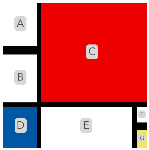 <div class="container"><div class="row"><div class="col-3"><div class="row">
<div id="a" class="col-12">
<!-- Piece A --></div></div><div class="row"><div id="b" class="col-12"><!-- Piece B --></div></div></div><div id="c" class="col-9"><!-- Piece C --></div></div><div class="row"><div id="d" class="col-3"><!-- Piece D --></div><div id="e" class="col-8"><!-- Piece E --></div><div class="col-1"><div class="row">
<div id="f" class="col-12">
<!-- Piece F -->
</div>
</div><div class="row"><div id="g" class="col-12"><!-- Piece G --></div></div></div></div></div>
- We have a
Comments
Post a Comment